14 Fabulous bread bag designs
By Erik Kristensen · 9. February 2021
Our bread bags
Bread bags are more of a niche product, which is why they are almost only used for baked goods or premade sandwiches, bagels and toasts. So all the companies using the bread bags are very much alike, it can be a really good design strategy to differentiate from the rest of the industry. We have in this article gathered some of the most used designs for the bread bags, but also some more creative designs for the bread bags – So you can get some inspiration and form your own design style for your bread bags.
Before digging into the different types of designs, then it is important to know that the bread bags that we produce are printed all-over, so it is possible to print all of the bread bags and use it to your advantage. The bread bags are either produced with kraft paper or with white paper, so either you can get a more natural look or make it easy for your logo or design to stand out.
Standard Bread Bag Designs – Kraft Paper
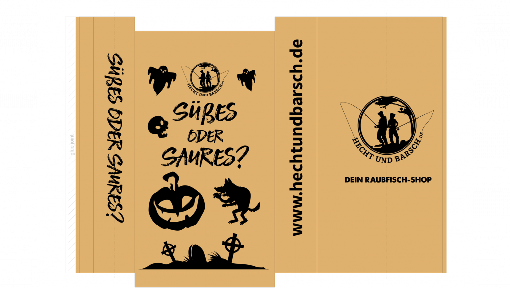
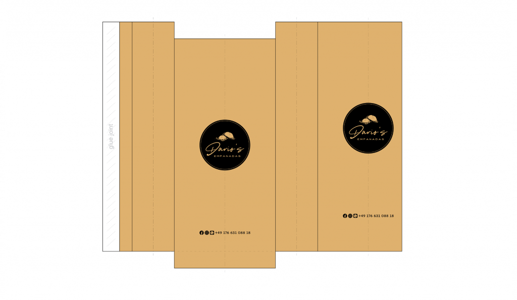
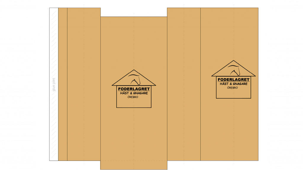
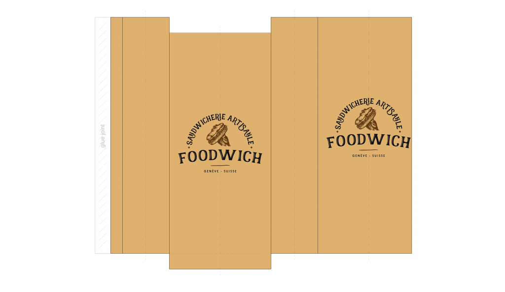
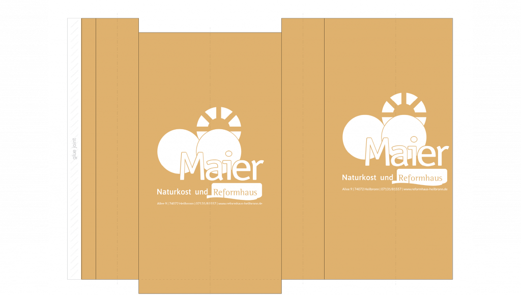
The majority of the designs that we make and produce for bread bags are made with kraft paper and a rather simple design. The design is often just the logo or illustration on both sides of the bag – And some of them also choose to get their social media information and phone number in the bottom of the bags. , and then in the bottom of the bags their social media and phone number is included.
The great thing about this design approach is that you make sure that your logo is seen no matter how the customer holds the bag – But because the bag is made with kraft paper it also looks very organic and natural.
Let’s dig in and see some of the designs…
Standard Bread Bag Designs – White Paper
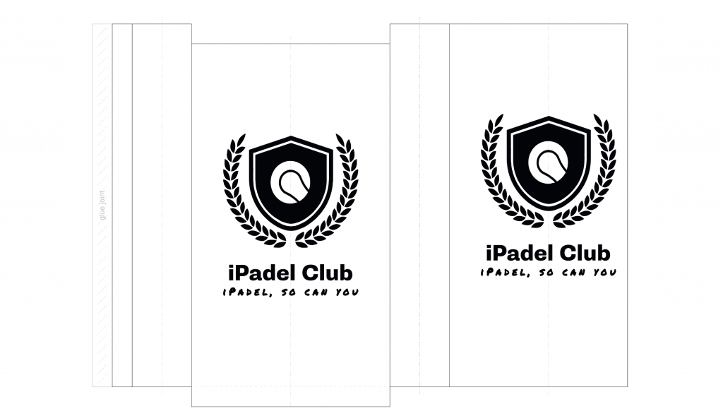
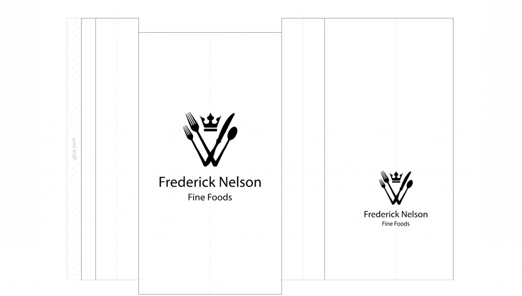
There is not really a large difference between the designs made on white paper and craft paper – but there is a large difference once they are printed. The whitepapers are more sterile but the logo is also easier to spot and especially if the logo is made in more dark colours.
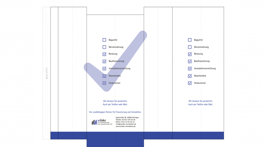
One of the things that differentiates in the design examples of the bags made with white paper, is that more of our customers choose to make the logo bigger on one side, and smaller on the opposite side. The primary reason for this is because it’s an easy way to show which side should be turning up and which side should be turning down.
Here are the examples of bread bags designs on white paper.
Special Bread Bag Designs – Printed Sides
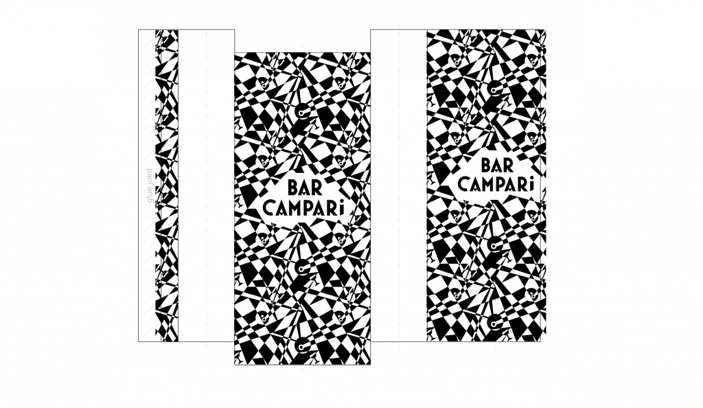
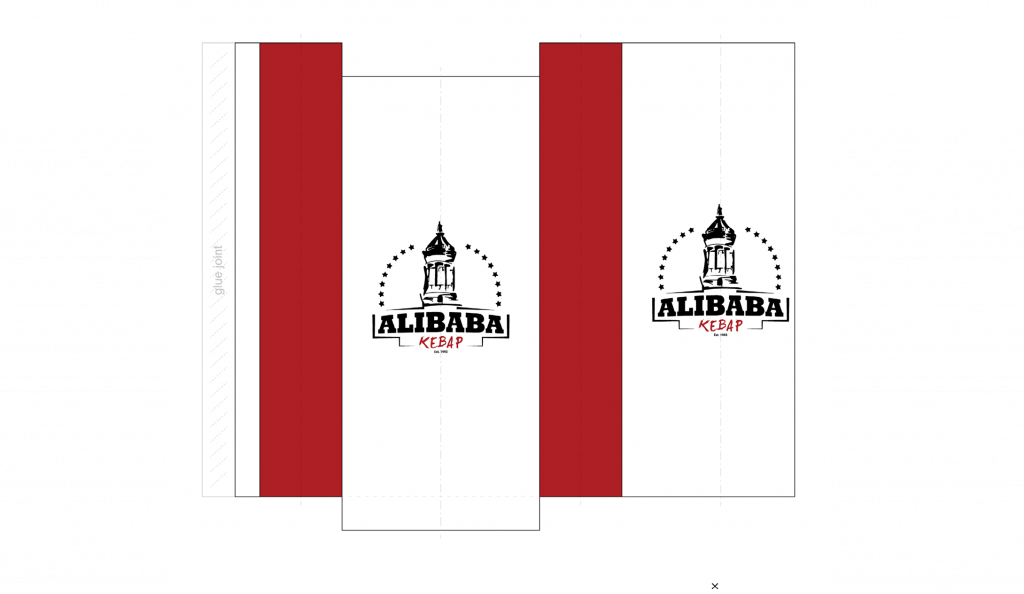
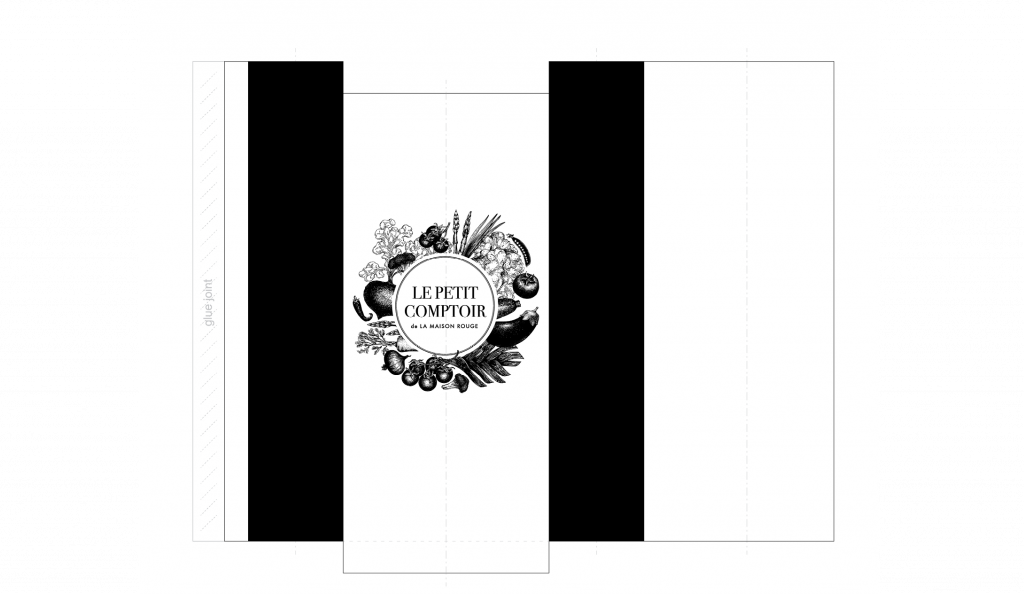
As I briefly mentioned in the start of this paper, the bread bags can be printed all over the bags. This can be used to spice up the designs a bit, so it is not only the logo on the front and back of the bags but it will have a key colour on the sides. The printing on the sides don’t have to be just colours it can also be symbols, design features or your design in a smaller version.
The cool thing about this approach is that you will still have your logo in focus and it will be really difficult to not see – But the design elements on the sides of the bags gives a kind of spark to the bags and makes it look like some thoughts have gone into the design process of the bread bags.
Here are some of the design examples with this style (And yes there are both examples of print on white paper and on kraft paper):
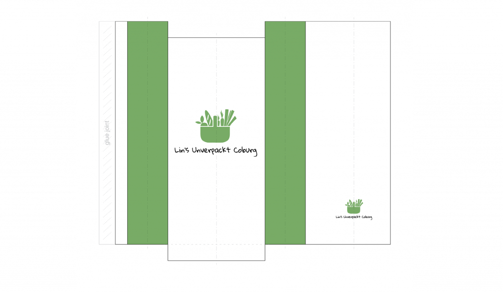
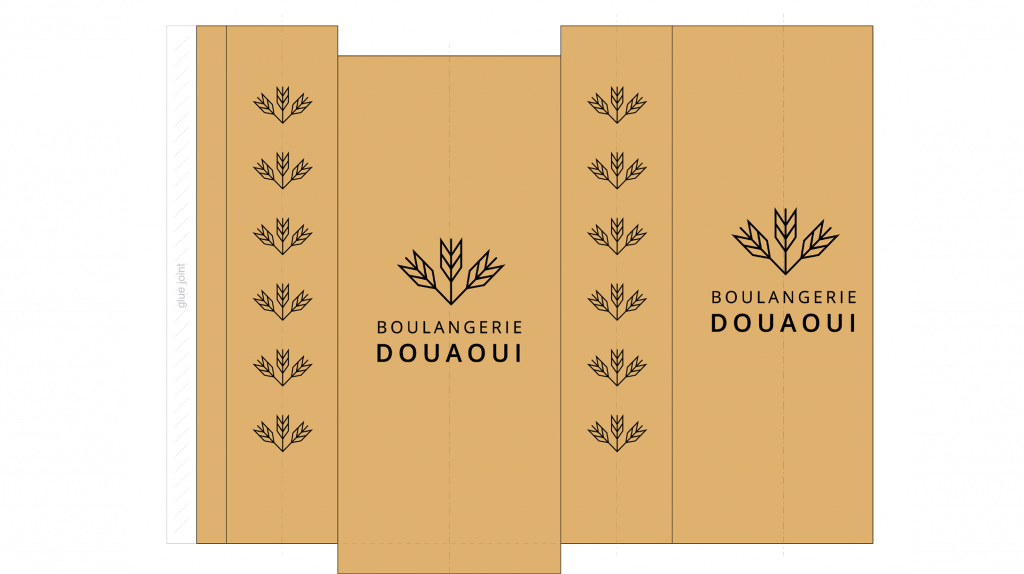
Special Bread Bag Designs – Full Print
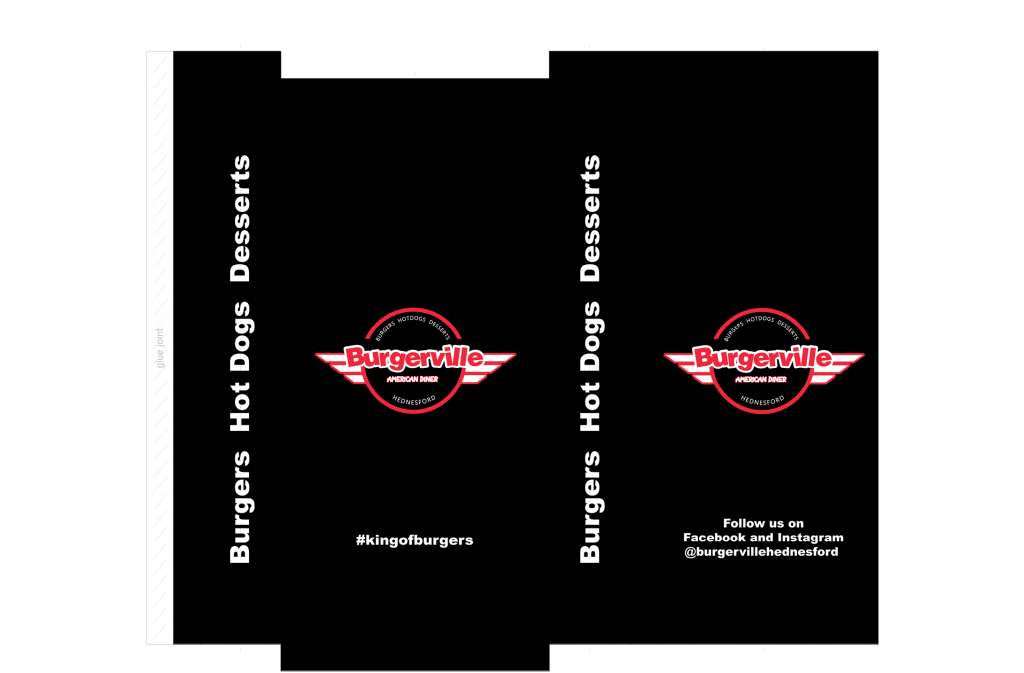
The last kind of design approach I wanted to show you is designs where the full surface is printed. This both includes designs where they have printed the bags in a other colour than white and kraft – but it can also just be having illustrations or elements that match well with the kraft or white background colour.
Using all the design possibilities on the bread bags can also be used to lead the customers attention to what you want to tell them. It can either be by putting the message/logo multiple places on the bread bags or having a creative that makes you want to turn the bag and see it all. I personally find both approaches really appealing since one of the methods gets the message out and the other one makes you remember the design and you will be able to see across other packaging or platforms.
Let’s dig into the designs and then you can see which of the approaches that you find most appealing.
