The 12 best paper cup designs we’ve seen
By Steffen Andersen · 18. February 2020
In Limepack we work with a lot of different customers and companies from all over Europe, who want custom made plastic cups. We give advice and help our customers with the design, in case they do not have their own designer.
We have made over 500 different designs for plastic cups, and with this article, we wish to give your inspiration for the design of your next cups, and show you all the possibilities available for you for the design. For this, we selected 12 original designs that will give you new ideas. 
We print our cups with Pantone colours. For the plastic cups that have a minimum quantity of order of 1.000 pcs., we can only print one colour in the design. For the plastic cups that have a minimum quantity of order of 5.000 pcs., we print up to 6 different colours in the same design.
Kiara
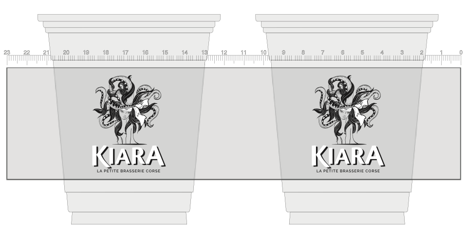
These plastic cups made for Kiara have printed their logo on both sides of the cup. The transparent plastic cups combined with the black and white colours in their text and logo will allow the customer to see both the logo and what the cup contains, at the same time. Even though Kiara has a very detailed logo, all the elements are fully shown on the cup thanks to the printing process.
SweetTOOTH
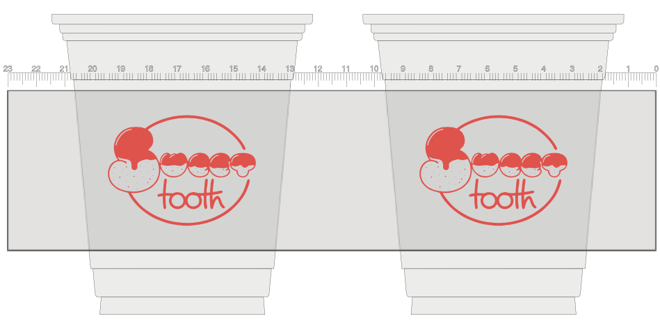
The design on the plastic cups for Sweet tooth has a sharp red colour, and their logo is written with capital letters for “sweet”, and normal letters for “tooth”. The difference in the styling of the text can make it a bit hard to read when looking at it, but reflects the idea of the brand completely. The letters form a kind of biscuit with an icing on top of it, showing that SweetTooth makes delicious delicacies.
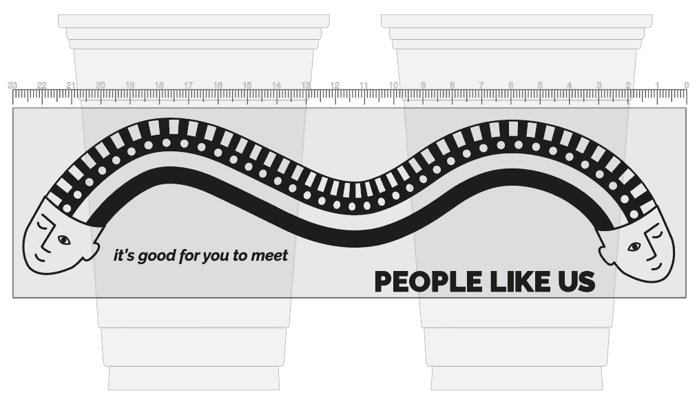
People like us
The design on the People Like Us plastic cups are making you feel welcome and part of the community anytime you enter the shop. The illustrations of the smiling faces say: “ You are not alone, there are plenty of us” and they are printed all around the cup to cheer you up, and make you feel connected with everyone in the bar.
The design itself is quite bold and eye-catching since it covers so much of the cup. They are using one black colour in the design, and the transparent cup as a contrast to the black colour.
L’ICE London
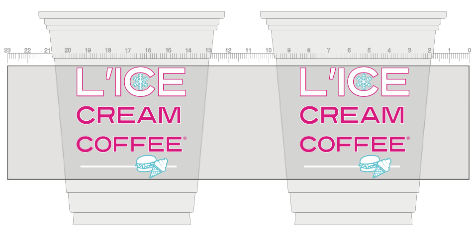
L’Ice London serves milkshakes, coffee, and ice cream in their shop and they have with the three coloured design, chosen to have a consistent branding image of their take-away packaging. The illustrations in their design also show that they do more than just refreshing drinks to take away : they also do burgers. The colours used are also associated with a fresh and summery feeling, that makes you want to savour a delicious milkshake on the go.
Sheygosh
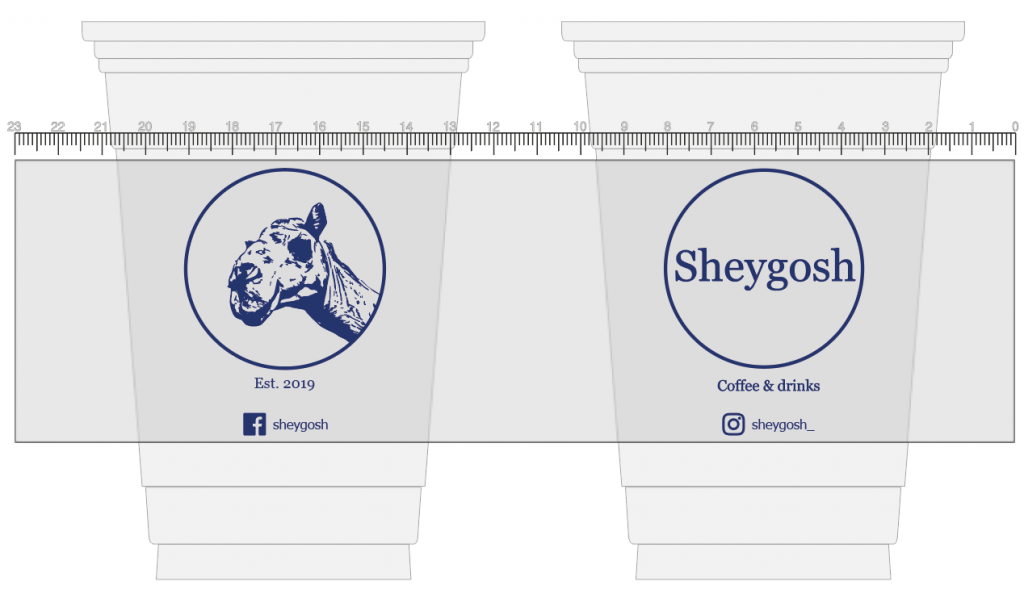
Sheygosh’s plastic cups have a one-colour design that is rather simple but has a lot of information. On one side of the design, they placed their logo, and on the other side, the name of the company. This is an easy way to ensure that no matter where a customer looks or holds the cup, they can see the design and recognize the brand Sheygosh. They also added their social media accounts so current or potential customers can follow them and see if they have any special events.
Event Øster Hurup
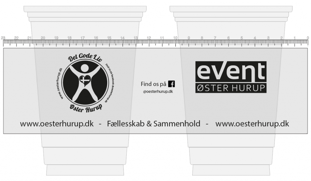
This plastic cup is used for a marketing campaign for Event Oster Hurup. They chose to have different illustrations on each side of the plastic cups to make sure that the customers will get all the information needed such as their website, social icons and their logo just by having their plastic cup. Event Øster Hurup used solely the colour black in their logo. The black colour is also great for contrasting the logo to the content in the transparent plastic.
Ciclon
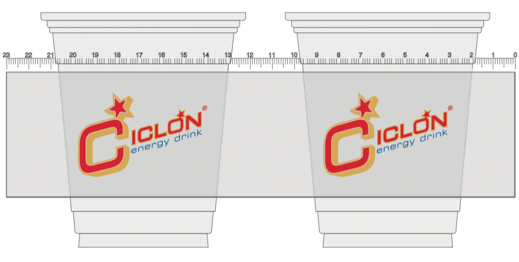
Ciclon wanted to have their logo printed in large size on both sides of the cup, so every energy drink lover can recognise them from far away. The combination of three bright colours – red, yellow and blue – gives a fresh and energetic feeling that boosts up the mood of every customer. Ciclon were very specific in the colours they wanted on the design, which was a great fit with the Pantone colours because they could give the specific Pantone colour code and be sure that it would be those colours that were printed.
Le Matou
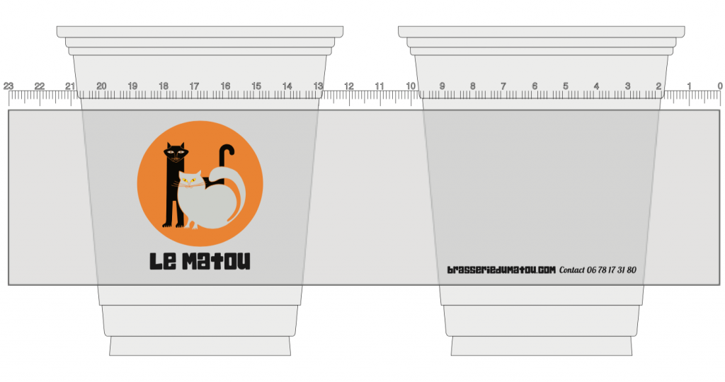
Le Matou has chosen a very minimalistic design for their plastic cups, this makes it easy for them to be aligned with their brand guidelines. They have chosen to only have the logo on one side to keep the design as simple as possible, and make sure that the customer understands that the logo on the one side is the only important thing to be remembered. The other side of the cup only contains their contact number, and enables the customers to contact them.
Utopia
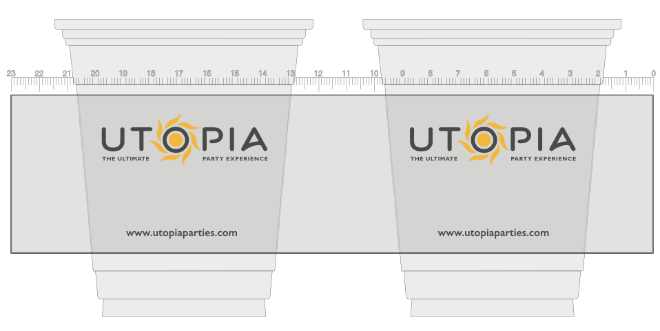
Utopia uses their cups at the parties they host every weekend. Their request for the design is rather simple. They simply want to remind their customers that the ultimate party experience for everybody is at Utopia.
The sun in their logo symbolizes many things such as a party until the sun comes up, and the summer feeling when partying. To make the logo as visible as possible, it is printed on both sides, and there is the link to their website on the bottom with more information.
Matcha
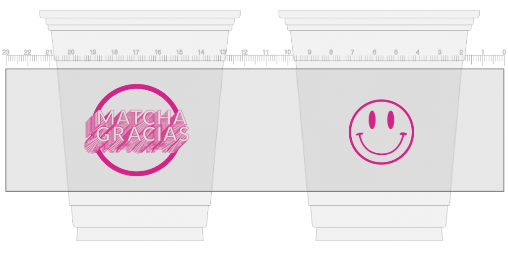
Matcha Gracias will warm the hearts of every customer with their bright pink design. The eye-catching logo is printed on the front and on the back is an illustration of a smiling emoji, because happy customers are the most important thing for this shop. The design speaks for itself so therefore there is no added extra text or icons on the cup.
Le Sa
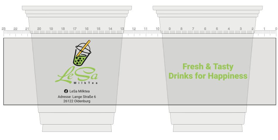
The design on Le Sa’s plastic cups illustrates their main activity, with the logo representing a plastic cups with a paper straw and their green tea drink in it. The design is refreshing, looking just like what you would get if buying a drink at Le Sa.
Showing the drink on the cups makes the customer want to get one for themselves. On the other side, they have written their slogan, and what their drinks are all about tasting a part of happiness. The great thing about noting your company’s standard information is that if other people see the cup, they will know where to go to find a drink like the one in the cup.
Kallpressen
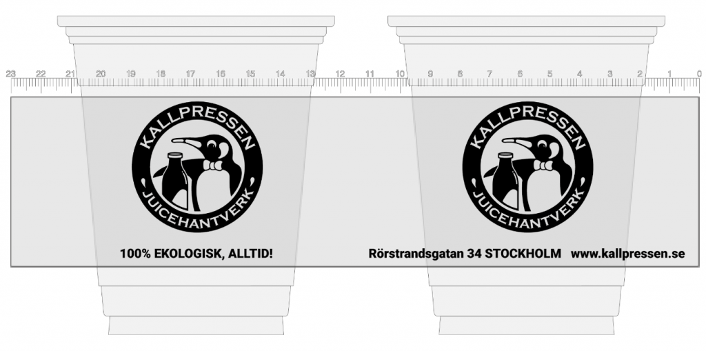
Design for Kallpressen shop in Sweden will give you a healthy and cute feeling straight away, because who would not like to buy fresh juice from the penguin? To make sure to show that their drinks are organic they wrote in black, capital letter that the drinks are ‘100% ecological’. On the other side of the cup you will find all of their standard information such as their address and website. They normally have more colours in their design, but due to them wanting a 1.000 pcs. they have chosen to have all of their logos in black.
